

The site
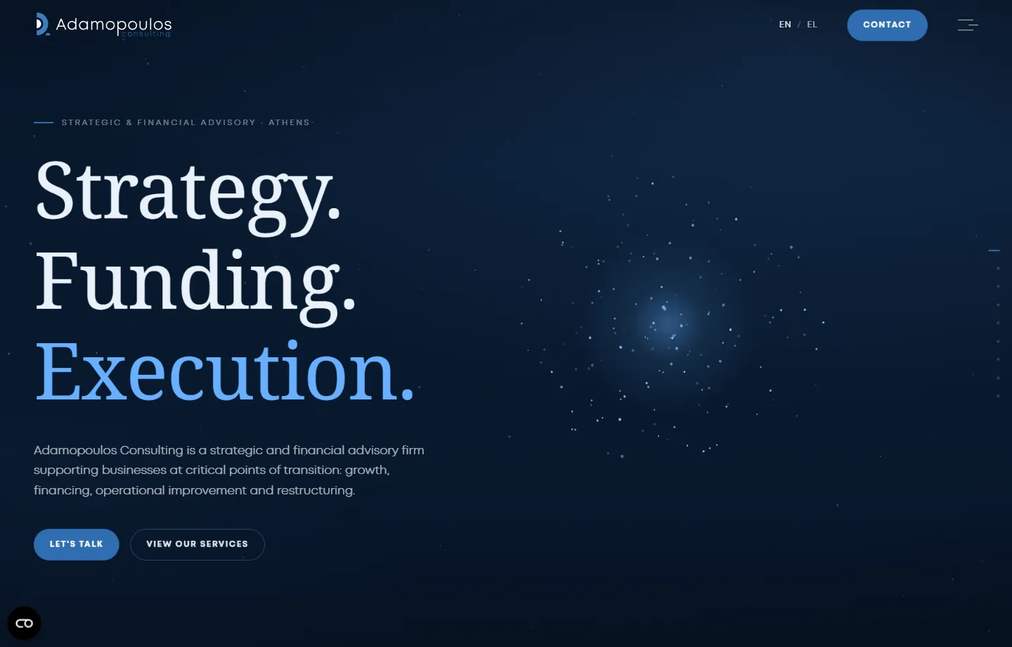
New-age design
Most advisory websites look like a printed brochure that learned to scroll. This one was built the way the firm actually works: one idea per screen, in sequence, so the homepage moves like an argument rather than a list.
The restraint is the point. One deep navy background across the entire site. One text colour at four levels of emphasis. A serif for the headlines that carries the authority, a clean sans for everything you actually read. Two motion speeds — a slow one for moving between screens, a quick one for buttons — so nothing ever feels arbitrary.
That is a very short list of ingredients, and it is why the site reads as expensive rather than busy. Anyone can add. Deciding what to leave out is the work. It is the part of our web design and development work that takes the longest and shows the least.
Nobody arrives at a consultancy's website wanting to read it. They arrive wanting to decide whether these people are serious.
The journey, and where it ends
A visitor lands with one question — can these people help me? — and the homepage answers it in a fixed order, then puts the conversation within reach at every point along the way.
- Who they are — Strategy. Funding. Execution., and one sentence on what the firm does.
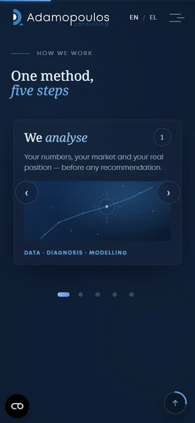
- How they work — one method in five named steps, moving through a carousel the visitor controls.
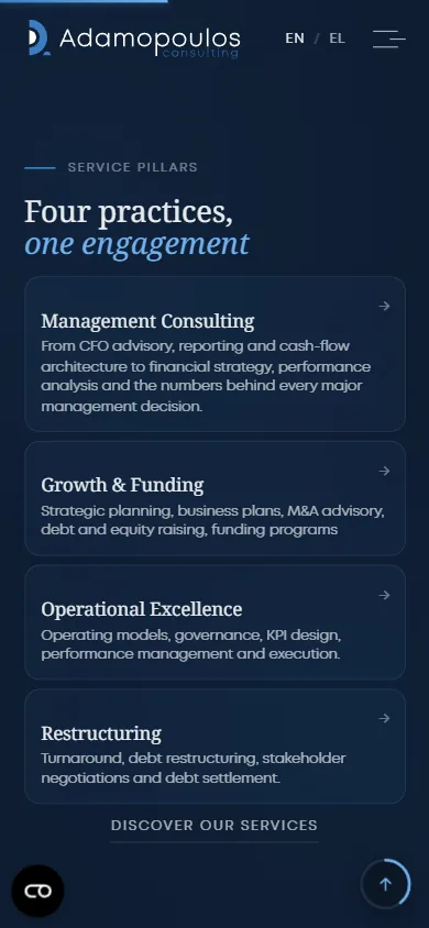
- What they cover — four practices, then the industries they actually serve.
- Why believe it — the client wall, then the firm's own quarterly insight writing.
- What now — the last screen is not a footer. It is an invitation: let's discuss the next step for your business.
There is no point in that sequence where the visitor has to hunt for a way to make contact. Four of the five calls to action on the homepage lead to the same place, and the contact button sits fixed in the header so it never scrolls away.
The same argument on a phone
Panel layouts are where responsive design usually gives up, because a screen composed for width has nowhere to go at 390px. Here the method carousel keeps its arrows and its step counter, and all four practices still fit on one screen — with the route to the services page sitting right underneath them.
How it turns into enquiries
The homepage never asks anyone to fill anything in — it asks for a conversation, and the form lives one click later. When the visitor gets there it is six fields, not sixteen: name, company, email, topic, message, consent.
The topic field is the one that earns its place, because an enquiry arrives already sorted into what it is about, and a firm that knows what the call is about before it happens can prepare for it. There is also a hidden field the visitor never sees, which quietly catches the automated submissions that would otherwise bury the real ones.
Fast, and deliberately so
The site is hand-written static HTML. No page builder, no plugin stack, no theme carrying features nobody asked for — every byte on the page is one somebody chose to put there.
The result is 684 milliseconds to first paint and 1.3 seconds fully loaded, at 813KB across 64 requests — with a custom variable font and an animated hero. Speed here is not a compromise the design survived; it is a consequence of the design being decided rather than assembled.
Method: measured in a real browser on the live site, desktop, 1440px viewport, unthrottled connection, 20 August 2026. These are page timings, not Lighthouse scores — we would rather tell you exactly what was measured than quote a number whose method nobody states.
SEO built in, not bolted on
The old site had an SEO plugin installed and very little for it to work with. The rebuild put the fundamentals into the markup itself, where they belong — the groundwork that every one of our SEO engagements starts from, because no amount of content rescues a site that cannot describe itself.
| Before | After | |
|---|---|---|
| Page title | “Αρχική” — the word “Home” | Written per page, with the service and the city in it |
| H1 | None on the homepage | Present, one per page |
| Meta descriptions | One generic paragraph reused | Written per page |
| Structured data | None | JSON-LD ProfessionalService |
| Crawl setup | Plugin defaults | Canonical tags, a 25-URL sitemap, robots.txt closing off the private paths |
| Tracking | — | Mar-Tech groundwork: GTM with Consent Mode denied by default, so nothing fires before the visitor agrees |
What we would tell another firm
A professional-services website is judged in about four seconds, and almost none of that judgement is about the words. It is about whether the thing feels considered — and then, immediately after, whether it is obvious what to do next.
Get those two right and the site stops being a brochure. It starts being the first meeting.
The services behind this project
Three of ours went into it, and they are not separable — the build carries the SEO, and the tracking only works because the build is clean.